Friday, October 21, 2016

Bookworming - The Well (1980) by Jack Cady


One of the most persistent tropes in horror is the haunted house and dang if I don't need to tell you that.  From the countless movies, books, "true stories", amusement park attractions and others you'd think that half the houses on your block will become haunted with little more than one measly murder-suicide.  As horror develops, as well as our psychological grasp on what horrifies us, the haunted house subgenre transforms along with it, adding new monsters, rooms and unknown threats, and while many of them are tedious there are a number of gems in the film canon, from Jean Epstein's The Fall of the House of Usher and James Whale's The Old Dark House to mid-century classics such as The Innocents, The Haunting and The Legend of Hell House and more recent successes such as Silent House and Crimson Peak.  There are plenty of literary haunted houses to choose from as well, such as The Haunting's source book The Haunting of Hill House and The Shining.  I'll admit that haunted house stories aren't my favorite subgenre, not that I don't love a number of movies that take place in them (and even more if you count how many non-haunted houses still confine protagonists in horror stories), but they often carry over a number of irritating problems and inconsistencies from ghost stories, the most primordial and yet most frustrating of horror genres.  The best haunted house stories are ones that shake things up, such as Mark Danielewski's House of Leaves, and during the horror novel boom of the 1970's and '80's the genre was defined by two major successes, The Shining and Robert Marasco's Burnt Offerings, among others.  One book sticks in my mind particularly when thinking about this period, and although it slipped through the cracks a bit at the time a recent reprinting by the excellent Valancourt Books may give it a chance to be reappraised.  Published in 1980, The Well was the first novel of Pacific Northwest-based author Jack Cady, a longtime professor at PLU, and is one of the most creative and unusual haunted house stories I've ever seen, it's wonderful setup diving head-first into the idea that the road to hell is paved with good intentions.

John Tracker is a man who has abandoned his own family, year before fleeing his ancestral home and the insanity of his elders, all of whom share the same mad quest: building the house with traps for the Devil.  In an effort to ready the house to be torn down to build a new highway, Tracker returns with his girlfriend in tow to see what remains of his family after a 20 year absence.  The house is crammed with traps and illusions, so much so that nobody unfamiliar with the layout can walk through without being killed, and since he's been gone new traps have come into being; this isn't helped by the presence of his grandmother Vera and the possibility his father and grandfather are maintaining and building traps.  However much Tracker thinks he knows the house it continues to change and baffle, revealing threats that are more than mechanical and the extent to how well the designs have worked - just not in the way anybody expected.

The Well is a great example of a book that can't easily be filmed, but not for a lack of visual content.  I'd wait in line overnight to see how the Tracker house would be depicted on screen, and considering how expensive a movie version of it would have to be the production values would most certainly be very high.  The problem with filming it is more that the true horrors come from internal struggles, from secrets and family histories, the collision of human ambition and otherworldly justice.  The house is more than the family home - it's a vortex of evil, accumulating every sin the Trackers have done to the world and twisting time and space to reflect its judgment.  Each chapter begins with a chronicle of the life of one of Tracker's ancestors, each one miniature jewels of storytelling in a mode that movies can never replicate.  As the climax draws nearer and Tracker's mission becomes direr the reader can feel an increasing weight of history and familial responsibility on his shoulders.  We live in strange times having lived entirely in an industrial nation - family bonds are probably weaker now than ever before and fewer young people are expected to carry on the traditions and work of their parents than in previous generations.  The Well was written during this shift and Cady was more than aware of where American society came from and where it was going.  The Tracker house is most certainly haunted and among the most byzantine and lethal of all haunted houses, but the resolution to the journey within it is a spiritual and philosophical one rather than a fistfight with ghosts.  I loved it, not just for its story and imagery but also for Cady's mature, silken prose, richly colored without being showy and proving that realist authors can have great love for poetry and metaphor.  It also helps that my copy is a first edition hardcover, complete with its dust jacket, that I got at a Goodwill for $3, and upon opening it I saw that it was signed by the author.  Perhaps time and space can be warped to deliver a message, in this case that I'm the exact kind of person to really love this book.  Step inside and be watch your step.

~PNK

Bookworming - The Fifty Year Sword (2005) by Mark Z. Danielewski


It's hard to properly assess a book as a "new classic", mostly because it's new and therefore hasn't stood the test of time to make sure that it was really all that great to begin with.  Being pushed out by a big publisher at the right time and with the right cover design can get a lot of critics to toss praise at it like flowers at an opera singer but that doesn't mean the book is actually good, just convenient for lots of people.  However, every now and then a book comes along that deservedly becomes a new classic, and in my mind no single book has had such a profoundly instant impact on literature and the cultural psyche than Mark Z. Danielewski's House of Leaves.  Originally published online in sections, the book became an underground phenomenon, eventually getting published in a lavish, expanded edition by Pantheon to overwhelming acclaim from all sides.  Presented as a matryoshka doll of found documents - Pantheon's editors reprinting a manuscript that was an attempt to publish an academic dissertation analyzing a documentary film - the book chronicles the attempts to understand, and disastrous influence of, The Navidson Record, a home-movie doc of a family moving into a large country house in Virginia only to find that doors keep appearing in the walls and as such the house appears to be larger on the inside than the outside.  The family's descent into horror is mirrored by the dissertation's author's own mental fracturing, as well as the guy who found his manuscript, creating multiple layers of postmodern insanity.  It's a stunning book, one of my favorite novels ever, and it assured Danielewski a seat at the table for years to come.  Each novel he's written after that works diligently to redefine how books can be written, such as Only Revolutions, a love story written in two halves for each romantic partner, presented as two halves on the page running in opposite directions from each end of the book.  His most recent project is the massively ambitious The Familiar, a projected 27-volume serial novel whose three published volumes each run over 800 pages, and even the barest skimming reveals lively formatting trickery from flyleaf to flyleaf.  Today, however, I want to shine a light on his third book, The Fifty Year Sword, as a finale to this month's Halloween Bookworming article series.  Originally presented as a multimedia show only on Halloween, the novella was eventually published in the US in another lavish Pantheon edition with a strange, bumpy cover and bizarrely brilliant formatting, and in my mind it deserves every scrap of praise it can get as a new Halloween classic.

The story is told as intertwining flashbacks, narrated by five grown-up orphans who spent a fateful night together at an East Texas foster home when they were children.  The occasion is the 50th birthday party of Belinda Kite, and for evening's entertainment a social worker has hired a storyteller for the kids.  The storyteller arrives with few words and a long box with five latches, and his story concerns the contents of the box and how he got it.

That might not seem like much of a summary but trust me, you'll appreciate my leaving most of the detail for you to find.  The impact of the piece lies not just in the content, which is as imaginative as it is creepy, but also the storytelling itself and the feel of being a kid, sitting on the floor and listening to that story.  The art of scary storytelling stretches back as far as storytelling itself and for many children is their first exposure to horror fiction; one of my favorite book series as a kid (and now) was Alvin Schwartz's Scary Stories to Tell in the Dark books, assured-but-simple retellings of classic folk tales, literary stories and urban legends accompanied by incredible ink drawings by Stephen Gammell, one of the greatest illustrators of the latter half of the 20th century.  In many ways the success of this format is the foundation of all horror literature, and in The Fifty Year Sword the success isn't just how amazing the story is but how effectively it simulates a classic oral tale.

Another effectivity (not a word but I'll take it) is the visual presentation of all this, one that is about as unique as any narrative book I've seen.  The text is formatted to primarily be in a snaking column on the left side of two page spreads, appearing as a unified narrative strand but using color-coded quotation marks to signify which of the five orphans is speaking it.  The "real" narrator is identified as a woman who was working at the foster home at the time but the actual telling is done by the orphans many years later, and the use of different voices to tell an identical story is a deft tool to show the psychological effect the experience has had on them.  These quotations, as well as illustrations that show up later in the book (and sometimes completely overtake the spreads), are sewn rather than drawn, using thin thread in striking color combinations that gives a fantastic and grim story a strangely home-and-hearth feel.  What this could mean I don't have a good answer for at the moment but I suspect that any answer, especially the most evocative one, is the right one.

By the time you're reading this it's pretty close to Halloween and you might not have the time to get this, but make the effort if you can - it's not hard to find and it'll take you less than an hour to read it if you're determined.  It's a striking objet d'art as well as a novella and makes a great gift in any season, but more than anything it's an exemplary addition to the tradition of Halloween storytelling and I'm so happy that Danielewski has been given such publishing leeway that books like this can get made.

~PNK

Bookworming - The Victorian Chaise Longue (1953) by Marghanita Laski


It's good to re-recognize every once and awhile horror literature, either in short form or long, as the genre is dominated in the public eye by movies, most of which are of low artistic merit.  While not all literature is good just because it's literature horror fiction writing has the capacity to be just as high quality as any other literary genre, and while some authors are highly well-known, even record-breaking in their success (as with Stephen King, still the best-selling author of all time), lots of great stuff slips through the cracks and there isn't nearly the same public fanbase that supports horror books like horror flicks.  While we've got a week-and-a-bit before Halloween I'd like to spotlight a few of favorite horror novels that haven't gotten nearly the attention they deserve, and first is a perfect little nightmare, Marghanita Laski's The Victorian Chaise-longue.

Marghanita Laski (1915-1988) was a British novelist and record-breaking in her own right, setting the high bar for contributing quotations to the Oxford English Dictionary, about 250,000 of them during a 38 year span.  As a novelist she's best known for Little Boy Lost which was later turned into a movie starring Bing Crosby; the only other book of hers still read today, though never discussed as part of horror history, is The Victorian Chaise-longue.  I snagged it off a dollar book rack at a local Half Price Books and blew through it in about an hour.  After retrieving my socks and pants from the spot they'd been blown to I slid it onto the permanent section of my shelf and today you get to hear why.

Melanie is a sickly, naive young woman, fighting off an encroaching case of tuberculosis with fluff and sweetness.  On a shopping trip she spots a decaying chaise-longue chair on a heap at a junk store and is immediately attracted to it, purchasing it at the weary approval of her husband.  She gets it home and is visited by her doctor, whose assurances of her improving health are poor masks for what is most certainly the opposite.  She decides to take an afternoon nap in her new chair, and upon falling asleep awakes in a different room, a different body and a different time.  In her sleep state she has been transported into the body of Milly, a woman her own age and suffering from the same sickness who owned the chair in the late Victorian era and lived in the house across the river from her own.  Melanie has only her thoughts as herself and is a prisoner in her new body, hardly able to move or comprehend what is happening and subject to grudging care by Milly's harsh sister, one who alludes to past tragedies that Melanie can do nothing about.  As Milly's health continues to degrade Melanie gets closer to the awful truth of their connection and her own fate.

More of a novella than full novel, The Victorian Chaise-longue plays out like the creepiest installment of England's A Ghost Story for Christmas TV movie sequence we never got.  This isn't the kind of horror that has to rely on violence to disturb, but rather crafts a flawless gem of nightmare, where each new detail piles on unease and makes the reader cringe at the plight of one of horror's most vulnerable protagonists.  Part of what's so disturbing is that it's crushingly unfair what's happening to Melanie; while all horror protagonists have to be frightened and threatened in order for the reader to empathize with them, they at least can gather their wits and strength and make a best attempt for their lives - not so with Melanie.  She's not stupid per se but she's not the most clear-minded person, either, and her consumption and out-of-body-in-a-body situation shackles her down.  There's a reason that you can't sentence a criminal to death if they're unable to comprehend what's happening to them or if they did something wrong, and it's that same horror at an unjust universe that creeps under your skin all throughout The Victorian Chaise-longue.  But the real kicker, the part that blew off my aforementioned socks and pants, was the ending, that screaming wallop of an ending that tied my insides into a Gordian knot, one that I won't dare spoil for you.

The Victorian Chaise-longue has actually been filmed twice before, both as long-forgotten teleplays from the golden age of TV, but it's high time someone took a swing at it in a new series, though it's also high time there was a horror anthology series worth a damn.  It's length, simple story and slightly repetitive structure make it an easy adaptation to a 30 minute runtime and a skilled director could wring every drop of tension out of the setup with little more than set design and camera angles.  A number of British literary high-ups quite admired it when it was first published, including Penelope Lively and P.D. James, the latter of whom wrote the preface to Persephone Books's 1999 reprint, currently the only in-print edition of the book I know of.  This praise hasn't earned it a real place in horror history, though, as most lists of great horror novels of the last century skip over it and not many reference guides remember it, either, most likely due to its restraint and lack of traditional supernaturalism (not that these are marks against it, mind you).  If you've got a spare hour or two before Halloween give it a shot - it might not hook you immediately but stick with it and you'll be profoundly floored.  It's one of the best surprises I've had reading books, and that should be saying something.

~PNK

Wednesday, September 21, 2016

Phonetic Phun, part 2 - Anampha


Clearly the next step in doing a George Plimpton-style excursion into the wacky world of phonetic alphabets was to try and design my own so I too can join the exclusive club of people creating scripts that nobody cares about or uses regularly.  As it's been a while since the first parts of this series, check out parts 1 and 1 1/2 of Phonetic Phun so you can get caught up on what I'll be talking about and which scripts I'm referencing.  In my reviews of the most notable phonetic alphabets for English some design principles made their case, guidelines that could assist in crafting a fine artificial script:

1.) Easy to write
2.) Internal logic
3.) Internal distinctiveness

Hopefully these rules are simple but comprehensive, making sure that you don't have something that's simultaneously confusing and difficult to write, such as Barton or Ewellic.  The elegance of Shavian was too tempting to ignore, obviously, so I'd need to keep some of the internal logic, such as having sounds that are clearly related, such as "ch" and "j", have similar shapes, and the fact that nearly every character can be written with a single stroke is also too excellent to ignore.  However, I wanted to avoid some of the confusion with Shavian due to its simplicity.  The "best in show" script for one that was less simple and less easy to write was Deseret, with its old-world, blocky personality, but that wasn't without its problems, such as a higher risk of carpal tunnel syndrome.  With all of these things in mind, here's what I came up with:


Yes, I know this is initial draft is all a bit much to look at at first, but hear me out.  My strategy was to take visual inspiration from the shape the mouth makes when forming each syllable, stylizing the shape as seen from a right-side profile and cross-sectioned to see just the front teeth, lips, roof and floor of the mouth and the tongue.  For example, "t" and "d" are formed by placing the tip of the tongue at the intersection of the upper front teeth and the roof of the mouth, and so the basic shape is a diagonal line meeting a straight one above it on the right side, making a 45 degree angle.  To differentiate the letters the "d" moves the lower line to meet the center of the upper line - this way neither one is too difficult to write and with practice it can be easily differentiated.  Likewise "f" and "v" are formed by placing the lower lip close to the upper teeth to create a small aperture, and I had sensed that my lower lip was placed a bit higher for "v" than "f", so therefore the intersection of the two component lines was placed higher.  Other visual relations included "n" and "m": "n" is formed much like "t" but because the sound was stopped rather than exploded I put a line dropping down from the diagonal to create a wall, and the "m" was that with an added tail at the bottom, like a cedille, to visually relate to how the lips close to create the "m" sound.  In each case a miniscule and majuscule was created - those lines through each letter represent the height relationship between each letter, so the majuscule letters extend above the miniscule ones.  There are a few graphemes that are similar to their Latin counterparts, such as the short "i" sound, and ones that are similar to different sounds in Latin, such as "u" which is identical to Latin's "o", but I kept true to my process and those symbols made the most sense to me both logically and aesthetically.  I wanted to keep majuscule and miniscule rather than do away with it like Shavian and Ewellic as a nod to how European languages write with clear beginnings to sentences and also to preserve the official status of names and titles.  I made a number of ligature characters not only for very common letter combinations, such as "st" and "sd", but also for all the basic articles and pronouns, as well as "and".  I kept another element from Shavian in making ligature characters for each vowel ending in an "r" sound as those combinations are so liquid as to appear as one syllable and they are fairly common in English.  I also couldn't resist borrowing an element of Deseret, namely the rule that you can use one character for "the", and in both Deseret and my alphabet it's the thick "th" character (as in "the").

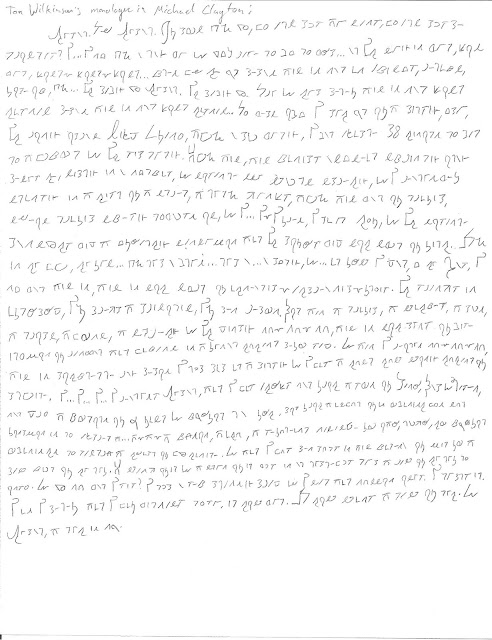
I believe the most important new inclusions, however, are two letter combinations that are very common in modern English but are conspicuously missing from all the alphabets I covered for these articles: the "x" and "qu" sounds.  I can understand their disqualification from the others on the basis that, not only can a case be made for their being two syllables rather than one ("ks" and "kw"), but they are imported from Latin-based languages and aren't true to the spirit of English's Germanic roots.  The latter argument is a bit hard to swallow these days, considering the Norman invasion was a thousand years ago and we've been using these sounds ever since then with no problem, but the first one merits discussion.  Yes, these sounds are both combination sounds, but I have a number of ligatures already made and there's no reason not to make two more if the price is right.  For "qu" I made a ligature of "k" and "w" with "w" on the left, making a kind of speech bubble character, and for "x" I created a new character entirely.  With both miniscule and majuscule forms as well as ligatures the alphabet contains over 100 characters, far more than any of the other scripts, but in doing this almost every syllable and fundamental combination in written English should be covered with a single grapheme.  I ended up calling the script (for now) Anampha, after "ANglo-AMerican alPHAbet", as I'm under no illusions that it would work for any other language; in the legend you can see its representation in the alphabet.  In keeping things simple and easy to write a few of the characters ended up looking similar, but in testing I was able to keep them all straight with some practice.  Here's a longish example, using Tom Wilkinson's big monologue at the beginning of Michael Clayton:


Obviously some small revisions were done to the original alphabet during and after this, such as removing the bottom line of "o" and the bottom connector of "p", things that made writing those letters unnecessarily irritating, but somethings I was very pleased with, especially the "ur" symbol, a sound that shows up a LOT in English.  I also quite like the capital "ai" symbol for both the letter and article, giving a prominence and grace to the beginnings of a number of statements in this example.  One problem that I still haven't worked out is how to represent hyphens, as "ee" is represented with an identical symbol in my alphabet.  As the symbol is now, a hyphen with an angular dip in it, it's difficult to write accurately and ended up looking like a mistake most of the time.  There are a few symbols which are still easy to confuse especially if hand-written, such as "ei" which is plainly an "ai" that got sat on - that grapheme is still tricky to write even after having written a substantial amount of material in the Anampha.  As you can see my own handwriting standards got the better of me occasionally, such as the drunken sense of line and letter spacing that ended up confusing me when reading these passages after the fact - these issues didn't exactly clear up after more writing, though as my assurance with the characters improved the spacing did start to resemble the words I was trying to write.  I managed to get out a particularly long passage, an entire short story by Lord Dunsany, a legend in the world of fantasy literature, called "The Hurricane".  "The Hurricane" is actually one of my favorite stories, the witnessing of a Hurricane speaking with an Earthquake, and you can see the full text here.  This is what it looks like in Anampha:


I'll leave that last line untranslated for those who like codes and Lovecraft references.  This was written before a couple final touches were made to the script but in essence it shows everything I was going for with Anampha: elegance, distinction and ease of writing, all cutting down the number of characters needed by roughly a third and clearing up inconsistencies.  In my excitement I came up with another idea, this one a bit more florid than the last:


These cast-off bits of wrought iron are the "ceremonial" version of Anampha.  If used in a more fantastical setting than the real world, such as a fantasy novel, the story's interior world could use a script exclusively for religious texts or government announcements, hence the "ceremonial" designator.  This practice isn't unheard of; Coptic is used exclusively as a religious language, and therefore its script is only seen in religious texts.  This script is written entirely in majuscule to denote importance and each character is treated like an individual, calligraphic entity, though it is hopefully obvious which character is which to someone versed in simple Anampha.  There are also no ligatures, meaning there are no contractions, so "it's" is written "it is".  The example is a mock wedding announcement for good friends of mine who are married in real life, and hopefully they'll find the inclusion amusing.  Because we don't live at Hogwarts the use of this in the real world is pretty limited, but hopefully I'll get two gravestones made so one of them is written like this.

After all this excitement and back-patting, a couple of horrible realizations came to me.  Like most other phonetic scripts I made different symbols for "s" and "z", and in writing words that ended in "s" I used both the symbols based on the sounds that people actually speak as opposed to the one they write.  Then it hit me: I'm using two different symbols to mean the same thing.  We say two different things to mean the same grammatical device.  But if I use two symbols...it...but then there's how we say different words the same that are written differently...and...I...grkh!

...

After regaining consciousness I could assess how much of a real problem this is, not just with Anampha but with all phonetic alphabets.  Grammar and speech frequently don't create one-to-one correlations, and the use of "s" and "z" to represent the written "s" at the end of a word for plurals is a perfect example.  In writing it's simple: we know exactly what sticking an "s" at the end of a word means.  In speech, however, we alternate "s" and "z" sounds to deal with which sound came before it, something we're able to do no problem in practice because we know the theory behind it.  Another example of bending the rules of grammar to fit speech patterns is the pronunciation of "-ed" for past tense verbs.  Most of the time we just pronounce it as "d" but sometimes we say "ed", and that can vary depending on your region and breeding.  For example, I learned to say "striped" as "straip-ed" but there's no good reason for me to say it like that rather than "straipd".  Poetry often differentiates between these pronunciations to fit rhyming schemes, marking the annunciated "e" in "-ed" with a grave accent.  Having to use diacritics is exactly the sort of thing that creating a phonetic alphabet is done to avoid, so by fixing that problem we've run into new ones.  It isn't just fundamental grammar that the alphabet sometimes leaves in the cold, but also the internal logic of the language itself.  One of the frequent arguments against spelling reform is that by changing how words are spelled the history of the word is obscured.  Written English is lousy with fingerprints from old influences, such as tons of borrowed words from Romance languages and old reform attempts, and some would argue that covering that up with further reforms will make speakers and writers forget the language's heritage and the populace would be poorer for it.  More importantly, spelling reform can often obscure etymology and word construction.  Say what you will about how overstuffed some of our words can look, but you can frequently suss out where a word came from and how it was invented just by looking at it.  The deeper you dip into etymology the more meaningful words become, and sometimes learning the original use of words based on etymology can uncover real poetry and add a new dimension to reading.  English speakers gave up pronouncing words based on their theoretical structure a good long while ago, so reforming spelling based solely on sound would trample across these hidden histories.  There's a temptation to calling these speech changes the result of laziness but that assessment isn't really fair when we took them as normal when first learning to speak and haven't done a damn thing to correct our own speech.

Are spelling reformers allowed to mess with these things?  In some ways we're messing around on sacred ground, scrubbing out parts of our cultural heritage and filling them in with new stuff to fit our eccentric desires.  Sure, we always do it for the betterment of humankind, but what if we're not expertly reshaping our script to make a better written future and instead are committing the linguistic equivalent of the time Mr. Bean accidentally wiped out the face of Whistler's Mother and tried correcting it in pencil?  And more importantly, why bother?  After all the work I put into creating Anampha, testing it, revising it and showing it to others, there was no point in which I thought anybody but myself would actually use the blasted thing, and not just because I'm a speck on a speck on a booger on a piece of gum on the bottom of a shoe in the grand scheme of things.  It comes back to that old phrase: "If it ain't broke, don't fix it."  Even if the non-broke thing is, in fact, broken, it's just "ain't" enough for us to grow up using it and lodge it so deeply in our muscle memory that no amount of logic and futurist optimism will get us to switch.  How many different techniques have arisen to stop hiccups over the years that actually work, and how many times have you switched your method in the face of new info?  I've been holding my diaphragm and sipping water for years but I've heard from reputable sources that swallowing a spoonful of dry sugar also works; I've also heard that the nerve that is overacting to create hiccups is the vagus nerve and that toying with it, specifically by inserting a finger into your anus and working it around, will stop hiccups dead in their tracks - that doesn't mean that I've adopted either of those techniques, and even though holding my breath doesn't work that well I'm not about to start fingering myself in public for the sake of taming my diaphragm.  And it's fine.  It's absolutely fine to stick with a less-than-perfect solution to a problem as long as it doesn't create problems longterm or on a large scale.  No matter how much cheerleading I can do for Anampha the majority of the population will see it as nothing more than an unnecessary finger in the butt.

Is there much of a future for Anampha?  Heck if I know.  My little project was for fun, not profit, and success wasn't even the deciding factor as to whether or not I was going to write this article.  I'll probably pull it out every now and then for yucks but I don't see myself writing professional emails in it any time soon.  There will be more phonetic alphabets in the future from hobbyists and nutters like myself of varying levels of success, and that's great - conlangs and artlangs are a fascinating enthusiast field and should continue to see as much development as we'll allow.  As much as I cringe at stuff like Ewellic I applaud small presses like Evertype for putting out editions of Alice's Adventures in Wonderland in the script just so the option is available to us.  In a world of near infinite archival space in digital form we shouldn't have to pick and choose which scripts to save and if nothing else each new script is another piece of the puzzle that is written English, another case either for or against spelling reform, and to be a good scientist one has to realize that there's no piece of evidence that's inherently not worth assessing.  Language is an art as well as a science, and scripts like Deseret, Shavian and even Unifon are artistic statements worthy of discussion and admiration, and I'm happy even if Anampha is just a miniscule addition to the ranks of speculative attempts at a better written English.

But seriously, fuck Ewellic.

~PNK

Sunday, June 12, 2016

Phonetic Phun, part 1 1/2 - Unifon, Barton and Ewellic


When I had started my Phonetic Phun articles I focused on what I considered the three most distinctive alphabet replacements in the phonetic English spelling movement, but those certainly weren't the only ones.  Today I'm looking at the three notable ones left over, Unifon, Ewellic and finally the pre-Deseret system created by the (brief) Mormon Michael Barton, and we can determine once and for all which one is the best and which should be buried under radioactive waste.


Unifon was borne out of a more specific project than most spelling reform projects, the magical realm of airplane communication.  In 1957 the International Air Transport Association chose English as the official lingua franca of the friendly skies.  The Bendix Corporation had a man named John Malone under contract and he had created his own phonetic alphabet as part of a larger project, but once the IATA made its decision the Bendix people decided to terminate Malone as the project he was working on, including Unifon, had lost its market.  Malone shelved his idea until some time later when he found out his Kindergarten-aged son couldn't read, and he dusted off his 40 character invention.  Through the '60s and '70s numerous tests were done to teach children the alphabet, which was often called a "training wheels" alphabet, and several articles were published in the '70s and '80s in publications like The New York Times and Science Digest.  While that was pretty much it for English applications there was a serious attempt, spearheaded by Tom Parsons of Humboldt State University, to adapt Unifon for transcribing Native American Languages (perhaps as a tonic for the surface horrors of Americanist phonetic notation) but after years of work the idea died with Parsons's departure from the university.  Well, 40 characters sounds about right even if not many people cared, so let's see how it fares with our favorite quotes.


Well, I must admit, of all the different alphabets this was the easiest for me to write as a native English speaker, and it would also have been pretty easy to decode the letters if I were given a passage without a chart.  Some words, such as "and" and "dump", look identical to their Latin counterparts, and unlike virtually all other phonetic alphabets I've seen there's almost no chance I'll be unable to distinguish one character from another if not looking closely.  Part of this is sticking to an all-majuscule format, keeping the letters large and clearly distinguished from one another; this also sidesteps Shavian's tall and deep letter attributes which, while helping a very simple alphabet look more florid, was tricky to get a hang on and almost requires lined paper to ensure readability.  This distinguished look for each letter does, however, port over Latin's complexity in writing each letter, especially majuscule versions which often rely on serifs to ensure readability, though thankfully Unifon doesn't require something as superfluous and busyworky as serifs.  (Oddly enough, Deseret's lack of serifs was among its criticisms when it premiered, but I found it part of why the alphabet felt solid and ageless, so maybe you just can't please anybody.)  For example, the long "e" letter takes four strokes, about three strokes too many that a letter should take to be assembled in a perfect world.  It was also tricky writing some of the letters, specifically the ones with lines touching their tops and bottoms, such as the long "o".  Believe it or not, it takes a bit of skill to draw those not only straight but just right so that they're clearly connected but not overlapping anything.  Also oddly hard to write properly were the sounds for "ch" and "sh", requiring a perfectly centered 45-degree slash so as to look aesthetically appealing and not obscure the letter it is derived from.  However, the biggest problem isn't any of those but one particular character that flies in the face of everything phonetic alphabets are supposed to be about.  Here's the lineup:


See that letter second from the right in the top row?  That vowel is impossible.  It doesn't exist in the English language except in combination with "r" to make "ur" as in "fur" and the fact that it was listed as its own grapheme infuriates me.  The whole appeal of phonetic spelling is to avoid crap like that from occurring, so what gives?  I've seen other Unifon charts which make it a ligature with "r", keeping the orientation as backwards from the short "e" sound just for clarity's sake, and that make a heck of a lot more sense than trying to fob it off as its own essential English sound.  And wouldn't it be more phonetically natural to write the "ur" sound as "ur"?  You know, with the Unifon letters that are identical to their Latin counterparts?  Also, wait a second...is that "ch" sound a "c" with a slash through it?  Like how "sh" is an "s" with a slash through it so as to distinguish it from where it came from?  There is no unslashed "c" in Unifon, so where did it come from?  "C" is exactly the kind of letter that phonetic alphabets do away with because of its inconsistent usage but John Malone thought it a good idea to port it over just to bisect the sucker.  Sheesh.  And what's going on with "w"?

Anyway, those problems out of the way Unifon is very easy to use and read, though I wonder about the long-term effect of using it as a teaching aid for children, only to have them transition to normal spelling later on.  Even though it got more press and testing than most of the other alphabets I still consider it a minor one for purely philosophical and aesthetic reasons, principally that it just doesn't stand on its own as a writing system not indebted to the Latin alphabet.  While forcing people to become accustomed to a heap of alien symbols might seem like a lot of work for spelling reform it's this radical restructuring of how words are constructed, not only on the page but in the mind, that helps reform spelling on multiple levels, so a script like Unifon seems incomplete and lacking in self-confidence, perhaps suitable as a transitional script but not as a true replacement for the Old Order.  Our next alphabet doesn't suffer from this problem nearly as much but, I gotta say, I'd take a lack of self-containment over having to write out this again:


The alphabet seen here was created by Michael H. Barton, a Quaker-turned-Mormon-turned-Shaker that I mentioned in the last article as possibly having influenced the regents of the University of Deseret in their alphabet-designing.  In 1833 (during his brief Mormon period) Barton published a series of pamphlets entitled "Something New" in which he introduced and showed copious examples of his "plain and simple" spelling system, containing, once again, 40 characters and a change to punctuation which I'll get to in a second.  His system is the most obscure of the six alphabets I went over for these articles and I can't blame the public for not latching on - they probably couldn't get past the first step, reading the characters.  I don't mean reading passages of the text, I mean being able to visually identify each symbol as being different from another.  As someone under 40 I've never seen much use in writing in cursive, except in the event that you've practiced it so much you can write whole sentences in a single stroke, and asking people to write longhand in italics is asking for serious trouble, so Barton's decision to slant all the characters to the right and use what should be ornamentation to assist in basic character construction grinds my bones to make his bread.  Ignoring for a fact that far too many of them are identical to their cursive Latin counterparts, these graphemes are way too similar to each other and the thick printing makes them barely legible.  I made it through both my passages without having found a legible version of the "k" letter, for example:


I later found an example in a thinner font that was clearer, but why couldn't it be legible to begin with?!  While the fact that letters are often paired off, such as the "ee" symbol being the "eh" symbol flipped upside down, that doesn't change the fact that the symbols for "n" and "y" are indistinguishable in the hands of a sloppy writer and the letters for "a" sounds, "u" sounds and others blur together into a gradient of annoyance.  (You can also tell how old this script is in that, much like Franklin's script, it includes a separate letter for the "wh" sound along with a "w" sound.)  The biggest problem, however trumps all those others and is not letters but Barton's baffling decision that normal punctuation wasn't clear enough and therefore had to be replaced by three lines of varying lengths.  Yeah, there's no possible way those could be mistaken in context.  Also, he does away with question and exclamation marks by replacing them with a dot and asterisk respectively, and then says to put them at the beginning of a sentence without saying what to do at the end, forcing me to "do it live", as it were.  He also doesn't think to include markings for apostrophes, semicolons and ellipses, and you might notice in the Shadow of the Vampire quote I had to make up symbols based on what he'd given me.  This is colossally short-sighted and I can't imagine how he could've missed it in testing, and might be the single biggest blunder in any of the alphabets I've reviewed.  On the plus side everything fits into a neat row of blocks like Unifon but still has a visual sweep, the curves more artistically florid than most constructed scripts I've seen.  If you care to read the collected form of his pamphlets, published along with a shorthand script I have no authority to judge, you can see it here, and while I can't recommend reading the entire book, mostly because I couldn't get very far myself, there are some juicy nuggets of archaic and, dare I say, pretentious prose, such as his open letter "To the Inhabitants of the World" on page 18.

One alphabet remains, and I hope you're glad that I saved the "best" for last.  Invented in 1980 as a secret script, Ewellic, the brainchild of Unicode contributor Doug Ewell, has a distinctly ancient flavor despite being invented more recently than any other alphabet seen here.  See if you can spot it:


Yup, you're looking at the work of a man who likes himself some runes, most likely because he likes himself some Tolkien.  There's also another ancient reference point, though one I'm not convinced that he knew about: the much-dreaded Ogham, which you may recall from my last article as being one of the most easily misread scripts in the world.  Believe it or not, Ewellic might just be more confusing than Ogham and most definitely harder to write.  This script is without question the worst of the lot, the unmemorable, confusingly interrelated graphemes so hard to keep track of that I had to switch between three different charts in order to write these passages.  Writing all those straight lines took far more concentration than anything Barton threw at me and it still looks like arseshite, and it compounds matters when half of them require three separate strokes, such as every single vowel.  The schwa was okay because it was just two vertical lines, but the listing for the script on Omniglot says that it was designed to have very limited use.  Ewell fancied himself a joiner of cultures so the script includes a lot of additional characters for sounds present only in the other major European languages, such as a set of graphemes for nasal French vowels, but that only makes me think that some poor Frenchman had this crap forced upon them by a grating hobbyist friend.  However, he doesn't include single letters for some rather common sounds like all the dipthongs and all the affricates ("ch" and "j"), claiming they're actually pairs of letters.  I kind of understand the dipthongs, perhaps as much as I wish for Ewell to understand how carpal tunnel syndrome arises, but "CH" AND "J" ARE EACH ONE SOUND NOT "T-SH" AND "D-ZH" YOU FOOLASS.  There's also the problem of grapheme recycling - because of how similar all the characters are many of them are simple flips of others, often creating sets of four symbols that are retrogrades and inversions of each other.  That doesn't mean that the characters have any phonetic relation to each other, such as how "m", "b", "w" and "v" are all the same grapheme in different orientations.  How does "v" relate to "b" in any aural way?  Why on Earth is "m" the same as "w" but upside down?  I -


- oh, you son of a bitch.

And, yeah, I'm so glad that not only did Ewell create a new set of numerals but also made rules for use with hexadecimal, an integral part of the English spelling experience.  What isn't included on the site is the rule that words with more than one syllable require an acute accent over the vowel of the stressed syllable, something that SEEMS KIND OF IMPORTANT BUT THE SCRIPT'S OWN CREATOR COULDN'T BE BOTHERED TO MENTION IT ON HIS OWN oh, never mind, this is hopeless.  Never in my life have I worked so painstakingly to write passages that I will have so little hope of remembering because of how poorly designed the script is.  Sure, I had trouble differentiating Barton but at least they had more shape to them than a bent milkshake straw.  Sure, Shavian was simple line forms but at least they could all be made with a single stroke and the tall/deep contrasts assisted in reading.  And sure, Deseret gets hard to read below a certain font size but at least that was nice to look at.  Hey Ewell - I gotta message for ya concernin' my likelihood of evah writin' in Ewellic again:


Well!  After all that commotion I can finally sum things up a bit.  My favorites were Deseret and Shavian, Shavian for its economy, ease of writing, elegance and internal logic, Deseret for its robust, timeless designs and memorability.  The one that seems the most likely to actually be used outside of hobbyist circles is Unifon but I can't endorse it too much for philosophical reasons.  Franklin's script was nonsense and was treated as such, Barton's was understandably too obscure for use and JEESH-US CRISPY CRACKERS EWELLIC.  And the good news is that I'm no closer to being a linguist than I was before - hooray!  Anyway, I guess we all know what the next step for me is...

...I gotta make my own, right?

~PNK

Sunday, June 5, 2016

Phonetic Phun, part 1 - Intro and the Distinguished Three


I love writing systems, be they real or fictional, widely used or extinct, deciphered or indeciphered, but at no point will I tell you that I'm any kind of linguist.  My lack of knowledge of the basic principles of linguistics makes me not even an amateur because all that I know is essentially trivia, making each statement made by myself on the subject an intellectual owl pellet of randomly gathered bits and bobs, the moss gathered by my mind's rolling stone*.  In my mind how a language is written and appears visually is a large part of its identity and for a non-speaking linguae viatori patuit** like myself the script makes far stronger an impression than the speech it is made to represent.  Naturally this means the more aesthetically colorful the script the better it is, which is why I put the primary Georgian alphabet, Mkhreduli


- at the top of my list of best scripts.  The script of Georgian is as unique and untraceable as Georgian itself (and its minority siblings in the Kartvelian familiy), its elegant loops as alluring as they are deceptively easy to write.  In my crypto-cruising I've found more veins of gold, such as Mi'kmaq hieroglyphics -


- the Coptic alphabet, especially when used for religious in religious texts -


- and most Mongolian scripts, especially the "classical" alphabet, seen here running along the right edge of the picture:


My recent research was spurred on by a tiny fit of asemic writing that I used to kill time.  See if you can see what's going on with this example:


Asemic writing is the same as writing, except that it has no real language content.  It's an artistic practice that creates abstract forms that resemble text but isn't meant to be deciphered or even considered decipherable - it's pure scriptural invention, totally unbound from semantics.  It's the kind of thing that someone with no interest in actually learning languages but a desire to see them come alive for aesthetic pleasure would love, and as such my one-time venture into it acted as a catalyst for me strolling the primrose path of Wikipedia's list of writing systems.  If you scroll down that page past the undeciphered scripts there's a big section called "Other" that includes asemic writing and fictional writing systems (such as Tengwar from Tolkien's works and the script from Codex Seraphinianus, the greatest thing in the history of things) and near the top of that heap is the subject of today's article, phonetic alphabets.  

Phonetic alphabets are designed to get around all the inconsistencies and unnecessarities of natural writing systems to better represent how languages sound, and one of these, the International Phonetic Alphabet (a bit too Eurocentric to be truly international, as most of it is based on the Latin and Greek alphabets), is very widely used for scholarly purposes.  Another one familiar to American readers is Americanist phonetic notation, used largely for representing Native American languages that previously had no literate representation (with confusing letters such as dotless question marks and "l"s with tildes) as well as some Uralic languages in Northwest Russia and Finland.  While both of these have proven useful in the right field the ones that caught my eye were attempts at revising or replacing the Latin alphabet for use with the English language, mostly created as part of a large movement in the 19th and early 20th centuries to reform English spelling.  The way English is written is horribly inconsistent, bulky and confusing to new learners, its history littered with poorly-thought out reforms (such as the trend in Chaucer's time to spell and order words to better resemble Latin, such as the "s" in island and the rule to never end a sentence with a preposition) and tons of borrowed French, German and Spanish words.  For spelling reform to catch on normal writers have to care about the difficulties in writing their own language and make a conscious effort to change their own writing practices for dubious practical gains, and considering how apathetic most Americans are about stuff like linguistics you can guess how excited the average 'Merican was about relearning how to write.  While none of these proposed reforms were implemented on a mass scale a few ideas did stick, such as a half-successful effort to simplify -ck to -c, such as with the words magic (from magick) and tonic (from tonick).  More than half of all the English spelling reforms were simply attempts to use the usual Latin alphabet in a simpler, more consistent way, but many others identified an inherent problem with the Latin alphabet, its inherent inability to accurately represent English sounds.  How many different vowels do we use the latter "a" for?  What about the inconsistent use of the letter "c"?  Why did we keep the letter "q" at all if there's not one instance of its use without "u" right after it in an English word?  Wouldn't it be nice if English had its own alphabet, tailor-made for our sounds and guaranteed to be consistent and easy?  My thoughts exactly.  (Though if this sounds like a bit too much for a foreigner to handle, think again: this excellent article by the award-winning Sci Fi writer Ted Chiang goes over how colossally difficult it is to learn written Chinese with any kind of speed.)

Enter supposed salvation from three wildly different but equally unlikely sources: Benjamin Franklin, Brigham Young and George Bernard Shaw.  I'm just as shocked as you how those three people could make it into an English sentence that wasn't "here's three famous people who spoke English:..." and the stories behind their alphabets are just as fascinating as the scripts themselves.  Part 1 of this article aims to examine all three of them to see if they hold water or were crummy from the get go, and in order to make both parts of this article palatable I'll try to be as George Plimpton-esque as possible, detailing my failures as much, or more, as my accomplishments and actually relevant information.

The oldest of these, old enough to predate the major reforms of the 19th century, is Benjamin Franklin's, created in 1768 in his essay A Scheme for a New Alphabet and a Reformed Mode of Spelling.  Rather than entirely replace the Latin alphabet Franklin opted to reassign and remove letters as he saw fit and augment them with letters borrowed from the Greek alphabet and some new graphemes that can be as hard to write as they are unappealing.  Personally, I can't stand it.  Just look at this:


Positively awful.  One of the most obvious ways to reform spelling is to remove the need for doubled letters, as English doesn't have varying lengths in the same way that Finnish does and they mostly serve to make words longer and bulkier.  Franklin's "solutions" to vowel inconsistencies add as many doubled letters as they remove and the additions from the Greek alphabet do little except make the whole thing seem derivative and eccentric, which is exactly what it is.  Click the link to the article and you'll see a grapheme missing from here, a ligature of "a" and "u" for the "aw" sound that looks almost impossible to accurately write in longhand.  I'll get to the good parts later but for now you can feast your eyes on my attempts to write in this nonsense.  I decided to do test drives on the three most distinctive scripts using a pair of moderate-length paragraphs of quotation, and for the sake of ease of scrolling I'll only post the originals once.  Because of how bulky the letter-to-sound charts are I haven't included them here; I suggest opening the articles on the alphabets in a different window so you can look back and forth.  Here's the first paragraph I used, and you might notice something a little off with it:


No, you're eyes aren't failing, that really is what that looks like.  When I started working on this article I was writing in the dead of night and mistakenly used a blue colored pencil of an unusually soft quality, so not only was it unnecessarily hard to write the first page it doesn't scan well, either.  You can blow any of the images up by clicking on them and I guarantee that less than half of the transcriptions are written using that pencil.  In fact, that's so unreadable I'm going to show it as it appears typed:


Much better.  Franklin's alphabet was actually the last one I tested, long after the other two, and so I used a proper pencil for a script that might not be worth writing in:


While some things turned out fine the result is a bit less than compelling.  This example has plenty of doubled vowels as per Franklin's resistance to making different letters for different versions of the five basic vowels, such as the use of "ee" to represent "ay" as in "bay", a decision that never looks right no matter how much I see what he was thinking.  This also results in an overuse of the short "o" combo letter of "c" and a dotless "i" and other awkward choices, some of them due to how different English pronunciation was in the Colonies in the 18th century as compared to now.  For example, Franklin bothers to distinguish "w" and "wh", marking the latter as "hu", and the minority usage of that sound today makes trying to write using the alphabet as a modern American English speaker more difficult that it needs to be.  Let's take another example:


Right off the bat there are too many "i"s.  Seriously, how hard is it to have one letter for the "ee" sound?  Also, "boy" should never have to be spelled with five letters.  Vitriol aside there are some good things Franklin did, such as creating graphemes for the sounds "ng", voiced and unvoiced "th" and the unvoiced "sh".  I know that I should have at least tried to get used to the "c-dotless i" for "oh" sound but it just never happened; there's just something wrong about having to make the "ow" sound with something that looks like "ciu".  I'll also admit that when I was writing this I forgot the letters the least frequently as with the other two because of how similar the alphabet is to Latin.  I think it's time that we just admit what we all now understand: not every invention of Franklin's was good.  Benjamin Franklin was one of the greatest minds of the 18th century, co-engineering the United States and making pioneering advancements in a striking variety of scientific fields, ultimately inventing things such as bifocal lenses, the lightning rod and his own kind of glass harmonica.  He was also a raging eccentric, and while eccentric renaissance men are my favorite kind of person it's safe to say that Franklin was a bit out of his depth.  I probably don't have to tell you that this alphabet didn't make it much farther beyond the pages of Franklin's essay collections and I have to say that it's probably for the better.

The next alphabet chronologically is the Deseret alphabet (pronounced precisely as it says on the tin), and even explaining its name opens up vast and fascinating alleys of history, the end of which we can't get anywhere near to in this article.  I had mentioned that Brigham Young had a hand in its creation, but that's not entirely true.  The alphabet was created in the mid 19th century by the board of regents of the University of Deseret, now known as the University of Utah, as well as leaders in the LDS Church.  In accordance with the fervent Mormonism of the alphabet's designers, the name of the alphabet and university comes from the Book of Mormon, supposedly the word for "honeybee" in an ancient language in Mormonism's sacred history.  The project was undertaken largely to create an English alphabet that would be both accurate and simplifying so people learning the language from another writing system or a non-literate culture would be able to learn the writing system easier, a fitting goal as at the time a large number of Scandinavian immigrants were settling in Utah.  While the project wasn't pitched as a religious exercise the practice of creating new writing systems for use in missionary activities has a long and dense history, including the adaptation of the above Mi'kmaq hieroglyphics by French missionaries - the image for that script is a depiction of the Lord's Prayer, one of the most translated bits of writing in the world.  It's also just like early Mormons to want to invent a new writing system, as the whole point of settling in Utah so firmly as to build a university there was to create an autonomous Mormon state, and a "State of Deseret" was proposed without actually getting off the ground.  The very individualist spirit of Mormonism in creating its own alternate history and interweaving Christianity with Colonies folk magic was the same thing that got them thrown out of New England in the first place, so it's easy to imagine the new script as being part of LDS nationalism.  While one of the main architects, Parley P. Pratt, was an LDS leader, the man who made the biggest contribution was George D. Watt, the first person from the British Isles to be baptized Mormon and a professional stenographer and expert on shorthand.  Unlike Benjamin Franklin, Deseret started with the right foot forward by being largely designed by someone with linguistic expertise, as well as having a committee to develop it rather than just one guy.  Let's take a look:


(Shadow of the Vampire)


(Carlin, which is hilarious to write in a Mormon-designed alphabet)

Deseret's designers got the first step right in correctly identifying all the sounds in English common enough to need representation by a letter, resulting in an alphabet with 40 letters rather than the usual 26.  This number wasn't reached by accident, as we'll see later, and help, as well as inspiration, might have been supplied by an earlier attempt at a new alphabet by fellow Mormon Michael H. Barton.  Barton converted to Mormonism from Quakerism and ultimately would leave LDS for Shakerism, and in 1830, during his Mormon period, published "Something New", detailing his own phonetic alphabet and featuring all the sounds featured in Deseret.  I'll be testing Barton's alphabet in a later, third article but as it made the least impression on people compared to the other three I forewent (is that how you say that?) testing it for now.  The greater influence on Deseret, at least in terms of inspiring the act of its creation, was the Cherokee syllabary, invented by the Cherokee Sequoyah almost out of whole cloth and an immediate success among his people.  Unlike the Barton alphabet and the Cherokee syllabary, Deseret does a great job at looking almost totally unlike the Latin alphabet both close up and far away.  The letters all look like they were carefully designed, fitting as the alphabet went through three major revisions in its early years, though I agree with the script's contemporaneous critics in that the uppercase and lowercase (called majuscule and miniscule in linguistics) versions of the letters should've looked different enough from each other that people shouldn't have to totally rely on making the majuscule versions larger than the miniscule.  The striking visual identity of each letter made it relatively easy for me to remember which one was which when trying to transcribe from memory, and the stockily florid feel of the script gives whatever is written a noble, official flavor, much like an ancient religious text***.  While some letters, such as the letters for "n" and "l", resemble their Latin counterparts, Deseret does a good job of shaking up our associations of shapes with sounds as to further force the reader to reorganize how they construct words in their head to fit a more appropriate English text.  The fact that the script is easy to read both close up and far away is more important than you think, as our brain accomplishes much of reading by guessing from cursory glances, and because of that the easier the letter identification the easier it is to read the script quickly.  It's also easy to see how many fewer letters I had to use to get the sounds I needed, and this was before I found out the custom in writing Deseret to use single letters for words that sound exactly like the name of the letter, meaning that "the", "and" and "you" all get to be represented with one grapheme.  Isn't it lovely when you create extra work for yourself by not reading the instructions?

Things aren't all milk and deseret pollen, though. A major omission from the alphabet is a representation for the "schwa" sound, the "u" in "but", a sound that is often arrived at by being lazy while pronouncing other vowels****.  Their solution is to use whatever vowel letter closest resembles what it would sound like if the stress was on the schwa, as English speakers habitually change vowels in words usually spoken quickly when stressing components of it, and because different readers hear words differently there's no right answer and variations can be annoying to have to read.  If you want a crash course in how Americans from the mid-19th century pronounced everyday words try reading the two Deseret readers from the 1860s (also read them because they're charming as all heckout).  Some shapes are recycled via flipping and rotation but the pairs don't match to related sounds, such as the long "a" being a flip of the "v" and long "e" being a flip of "z".  Some of the letters are hard to write, specifically "k" and "g" - I was never able to write it in a way that wasn't lopsided and disconnected at one end or another.  The "g" is one that's hard to read, especially when the print is small, because of the bang-like curve inside of them; another one is the "ew" with its 45-degree cross in a circle.  All that being said I was very happy with Deseret in writing and aesthetics, succeeding more in autonomy than the Cherokee syllabary it most closely resembles and making up for its shortcomings with little tricks and charm.

One of the most interesting resources I found on Deseret was a blog written by a former University of Utah student who was introduced to it briefly in his studies and later went on to work on Unicode, the programming structure that allows computers to render international scripts.  In the first post he described that at a certain point in Unicode's development the programmers realized they would have to do a major overhaul, and long story short developers needed to choose a handful of scripts to create Unicode for that could sit in outer levels, beyond current support, for an indefinite period of time without getting too many people mad.  Deseret was one of them, as well as Pollard, another script devised by a missionary.  A third was the third major phonetic alphabet that I tackled and arguably the most famous: Shavian.


George Bernard Shaw wasn't at all opposed to writing English in a newer, simpler way.  He frequently wrote in Pitman shorthand, knew Henry Sweet, the inventor of Current Shorthand, and during the 1920s and '30s served on the BBC's Advisory Committee on Spoken English which broadcast many examples of phonetic spelling.  In his will, Shaw made arrangements for a campaign to make a new English alphabet that had at least 40 letters, was as phonetic as possible, and looked nothing like the Latin alphabet.  Isaac Pitman, along with the Public Trustee, announced a worldwide competition to design the alphabet, which resulted in four winners, including Ronald Kingsley Read.  Read was appointed to amalgamate the best candidates to create the new alphabet and Shavian was born.  Let's see it in action:


Shavian is a marvel of simplicity and unity.  Most every letter is paired, with consonants mostly paired by voiced and unvoiced, such as v and f, and these pairs are the same symbols rotated 180 degrees, giving the script an unparalleled internal logic.  Each letter can be written with a single stroke and a very quick one at that, aside from the eight ligatures for vowel/r combinations and common combos like "yu", and at no point can I imagine anyone having trouble seeing details in these at any distance.  Both Deseret and Shavian do a fine job at identifying the most common English sounds, though Shavian has an upper hand in that it has the schwa and clears up some of the long/short vowel confusion to better align with modern English.  The ligatures for vowel/r combos were a brilliant idea, especially the "ur" sound that, as I've found with practice, occurs quite frequently in normal English.  However, there is one major issue here, one that I'm sure reading practice would clear up but needs to be addressed...there is such a thing as a script being too simple.  It's easy to see how much of a reference shorthand must have been on Shavian because the letters are often so simple that they become very easy to mix up.  I found myself forgetting which letters were which way more with Shavian than with Deseret and even Franklin's alphabet.  If you think I'm just a complaining simpleton, let me give you some context.  Here's what I consider one of the worst scripts in the world, Ogham:


Used to write ancient Celtic languages, Ogham's notchpiles carved into tree-like lines are some of the easiest graphemes to misread, with one wrong line resulting in a hot mess.  This is one of the least distinctive scripts I've ever seen and Shavian's pseudo-shorthand look strays a little too close to this for my comfort.  

Another major writing change with Shavian is the lack of miniscule and majuscule letters, instead having "tall" and "deep" letters that are either above or below the normal line.  As you can see in the examples I had a hard time getting used to it and occasionally tried starting lines with "capital" versions of the letters or had to respace everything mid-line.  The solution to writing names was to have a "naming dot" precede them, as you can see in the attributions at the bottom of each paragraph.  It's an interesting concept but I'll have to tackle the main problem with it in a later article.  It's certainly better than grammatical changes in some phonetic alphabets *COUGH*BARTON*COUGH* but we'll have to wait until the next article for the worst changes to Latin punctuation.  The good news is that Shavian's successes outweigh its limitations for a refreshing shakeup of the Queen's English.

That above cover for the Shavian (or Shaw alphabet as it's called equally as often) edition of Shaw's Androcles and the Lion was published with funds from the Shaw trust, but because of that very fact it was the only book published in Shavian at the time, aside from a newsletter with fan-submitted Shavian content.  That's a pretty pitiful amount of exposure for a movement to transform the written face of a language spoken by billions, though at four books, newspaper articles, a coin, a tombstone and unpublished material Deseret wasn't that much more exposed, despite the best efforts of the regents of the University of Deseret.  A major roadblock in publishing material in these alphabets is the practicalities of typesetting before the computer age.  Creating all those letter tiles and hiring people to painstakingly set type in an alphabet they might not fully understand, all on top of hiring people to transliterate book-length bodies of English into alphabets with different "experts" arguing over spelling was both unaffordable and headache-inducing at the time.  The good news is that, now with computer software like Unicode it's way easier to create typeset documents in all the scripts you can think of, and as such there are Ebook solutions to your spelling nightmares, though mostly in Deseret as part of a thriving Deseret Alphabet Classics series.  One book that you can find in both alphabets is Alice's Adventures in Wonderland, created by the fantastic publisher Evertype, a specialist in using digital tech to publish books in minority and constructed languages and scripts.  Alice has been used by the publisher as a platform for publishing in dozens of obscure languages and alphabets, including Shona, Lombardy and Lingwa de Planeta.  Though skimming of the Deseret Alice revealed many inconsistencies and flat-out errors its great to see so much work put into such a niche practice.  Perusing those various Alices also brought an Ewellic edition to the surface, and one thought crossed my mind - what in the Sam H-I-Double-Hockeysticks is Ewellic?!

...stick around for the next part to find out.

~PNK

*...wait, shit.

**Fun fact: if you put this into Google translate you'll resent me for having to do so.

***Prank idea: carve a quote in Deseret into a large rock and claim it's a thousands-ish-year-old artifact from a lost civilization.

****Uh thuhsuhnd yuhrs fruhm nuhw uhll Uhngluhsh wuhrds wuhll buh schwuhs bruhkuhn uhp buh cuhnsuhnuhnts. (A thousand years from now all English words will be schwas broken up by consonants)